Thursday, October 30, 2008

poster analysis

I chose for my assignment is Friday Night Lights. The title Friday Night Lights is referring to high school football games, played on friday nights. This title is very appropriate for the movie because it is about kids who have all kinds of problems in school or personal lives but when they step on the football field all there problems go away. The font of the title is extremely bright and everything around it is dark. This is because under the lights of the football stadium the students have something to hope and wish for. The poster does not include any one person in particular but includes a line of football players who's faces we cannot see. I think this is to show that not one player is above the team and everyone is equal because they are a team. The players on the poster are standing up tall and proud and are all in a single line. This shows the discipline that is required of these players. They seem like a army that moves as one, and there presence sells the film because it shows the seriousness of these players and football. The background of the poster is fairly simple. It is very dark, which shows the backgrounds these players are coming from. They all have personal problems but everything is forgotten on the football field. The tagline for the film is "HOPE COMES ALIVE ON FRIDAY NIGHTS." This is very appropriate for the film because friday nights is the time where these players shine. It is the only night where they truly become someone. Friday night means everything for these football players because of there troubled lives. I think everything about the poster adds up to a wonderful message, which is shown in the film as well as the poster. It is a message about hope and coming out of adversity.

poster analysis

http://www.allposters.com/gallery.asp?startat=/getposter.asp&APNum=2370348&CID=71E5E149AD3846B7A745E6667545ECAA&PPID=1&search=96029&f=c&FindID=96029&P=1&PP=1&sortby=PD&cname=Knocked+Up&SearchID=

The poster I chose was for the movie Knocked Up. The title of the movie relates perfectly to the poster, with Seth Rogan and Katherine Heigl sitting in a waiting room, clearly a Gynecologist office because there is a poster in the background and pictures of “Timeline of Pregnancy”. The two have unhappy looks on their face and don’t seem to be happy together while looking at their body language, which is true because they aren’t happy with each other for parts of the movie. The font that is used is a plain, big, and red font that just says Knocked Up. The font is blood red and easily can catch ones attention. This could show that the title is really important, which it is because it basically explains the movie in two short words. The coloring is very light, which definitely doesn’t show scary, it could show a few things, but definitely not a horror film. There are two people in the poster, the two main characters, and they are both unhappy. They are wearing casual clothes, jeans and shirts. They look like completely normal people. The girl basically looks pissed, and the guy looks confused, but they both look unhappy with the situation. This makes the film look like it will be somewhat complicated, because there’s a problem already in the poster, so it’s likely that it will be solved or dealt with throughout the movie. The background of the movie is pretty simple, a Gynecologist office, chairs, and a poster. This doesn’t do much for the main image; it’s a pretty simple background. The tagline in this poster, “From Judd Apatow, Director of “THE 40-YEAR OLD VIRGIN” Comes a comedy about a one night stand That became something more.” It plays off the title and the image pretty well and begins to put pieces of the puzzle together. When putting the words “one night stand” and “knocked up” together, it can’t be good, but it tells more about the movie. It kind of makes us want to think, “uh oh” and watch to find out. It adds a meaning that there’s more that “has” to happen in the movie because of the one night stand. The overall message of this poster is that there is a problem that needs to be solved. Because the tagline says that a one night stand will turn into something more, we now know the problem. Makers of the previous comedy, “The 40-year old virgin” wouldn’t go from a comedy to a completely serious movie, so we know because of this director’s history, it’s going to be a funny movie. The small things such as the tagline and the expressions on their faces assure us that there is a problem, and the background of the poster, tagline, and the title of the movie give us a hint of what that problem is. There are just a lot of pieces of the puzzle that can be put together if you break down parts of the poster.

Poster Analysis


The movie poster that I chose to analyze was that of "Beowulf." "Beo", in the actual movie (recent film), is said to mean bear. The movie poster shows his strength by what he is wearing. He looks like a warrior so it could be said that he has the strength of a bear. "Wulf", pronounced like "wolf" is also a descriptive word of how he behaves during battle. Thoughout the movie he shows that he is cunning and quick on his feet like a wolf. The wolf is also displayed on his chest like a badge of honor. The title's font is displayed like it was meant to have a certain "oldness" to it. It makes me think of medieval days when there was a king. It is appropriate because that idea is what is shown in the movie. The poster shows Beowulf in a bluish-grey tone while being contrasted with fiery red spots. If you look hard enough it almost appears as if there was an evil, fiery face coming toward him. This is validated in the movie when in fact a dragon attacks him. Beowulf is dressed in a way that seems more boastful. His armor does not cover his arms and he wears no helmet. Perhaps he feels that he does not need the extra armor because he sees himself as such a successful fighter. He was probably portrayed in this manner to reveal to the audience his ability as a fighter. On the poster, Beowulf's name is underlined. This signifies importance, and it could be a justification as to why he is the only person on the poster. It is almost like he is a warrior, but he has no army behind him. This could describe his character. Maybe he feels he does not need any others to help him fight. The background of the poster is simply clouds. There are no distracting colors. Everything seems to just focus on him. Basically the entire message of the poster is that Beowulf is a very strong and very cunning warrior from the medieval times who fights what is thought to be evil or monstrous.

Wednesday, October 29, 2008

Poster Analysis


The word mystic seems to represent ideas or concepts that are just not understandable or very complex. Just by reading the title of the movie Mystic River, it seems like the plot may revolve around this concept of phenomenon that is not known or not understood. The title is not very showy, it is very bland actually. The only part of the title that sticks out is the shading of it which is still very simple. But this shading gives off a strong meaning. From left to right, the title starts off with a white and slowly fades into a dark shadow of gray. My interpretation was that the white side could be the knowledge that is known while the darker side could represent the undiscovered or the unknown. The rest of the poster continues the theme of this unknown. The dark body of water that takes up most of the poster has an eerily sense to it. It is very bleak but also very vast. With something that big, it would be hard to discover everything there is to know about it which may be a connection to the ideas in the movie. These ideas may be so complex that there is just no physical way of knowing and understanding every aspect. Then there are the reflections of what seems like three men. Strangely, these reflections fall right into a light spot in the water although it is very faint. These characters may be studying this unknown concept of the movie and the light spot may symbolize the knowledge that they have about it. But back to the men, the poster shows no other details of them. They themselves are mysterious to the viewer. If the men were actually be able to be seen would most likely cause a clash with the rest of the poster. Just by looking at a person’s physical features, a lot could be extracted about that person. All in all, there is not much information that could lead to a definite plot to the movie. But with all the mysterious parts to the poster leaves the viewer with this suspense of wanting to know and to satisfy their curiosity as to what the plot is.


Tuesday, October 28, 2008

Poster analysis

The poster that I will be analyzing is a poster from the movie The Dark Knight. The poster of the movie relates to the movie because the image of batman standing on top of a building is dark. His face is covered with shadows and so is most of his body. This relates to the story because the batman in the movie is a really dark character. The font of the title is really small and this shows that the poster was to focus more on the image of batman than the actual words. There are not a lot of colors used in this poster. The only colors used are black, brown and a little bit of grey. The color does affect the message of the poster because it shows that the movie or the main character is a really dark character or movie. There is only one person in the poster and it is batman. He is in the poster because he is the main character of the movie and the title relates to him. He is standing on the top of a building wearing his bat suit. He is staring down at the audience and he is holding fist as if he is ready to fight someone. He looks like he is ignoring the call of batman which is right behind him. Batman here does not look friendly because of how dark his figure is and how his hands are in fists. The background of the poster is the city and it seems that batman is ignoring it because he is looking away from it and the batman call. The background of the poster also adds darkness to the movie. It shows how dark and cloudy a city could be without batman. The tagline is included in the poster. It adds the same darkness as the poster. It really doesn’t matter if it was there or not because the poster is really dark as it is. The overall message of the poster is to show that this movie is going to be a very dark and evil movie. It shows the main character as a dark and evil character. You can tell that batman will be a lot darker and evil in but not in a villan sort of way.
http://www.allposters.com/-sp/The-Dark-Knight-Posters_i3399187_.htm

Poster Analysis

I am analyzing the movie poster to Mr. & Mrs. Smith. The title of the movie relates to the image shown in multiple ways. For one Angelina Jolie and Brad Pitt are married in the film and also Mr. & Mrs. Smith is sort of a basic title which properly displays their marital roles in the film. There are two types of fonts on the poster and this is significant to the movie. As previous stated, the main title Mr. & Mrs. Smith is written in a simple text. This text is important because during the film Angelina and Brad are a married couple who together lead a basic lifestyle. They are both oblivious to their identical alternate lifestyles. Both Angelina and Brad are world class assassins whose most recent job is to kill each other, and this fact makes the bolder font on the movie poster acceptable. The bullet holes as dots are also important in this poster giving the couples occupations. Once again, the low-key lifestyle of the main characters calls for the simple black and white colors of the background, but the red is definitely significant to and portrays the alter ego’s in this film. The color affects the message of the poster because the red throws a twist into the simplicity. The two people on the poster are of course Angelina Jolie and Brad Pitt. On the poster they are facing each other, but there is a large gap between the two. This can show the actual distance that is amid the main characters of the movie, but at the same time shows their devotion to each other which comes across in the latter parts of the film when the two refuse to kill each other and eventually team up. In the poster they are wearing elegant clothing as if going on a date, but their facial expressions and weaponry tell a different story. A lack of trust is sensed within this detail. The background of this poster is a simple white back drop. This could have been done to draw more attention to the characters. The entire poster can be used as foreshadowing of the film through aspects of the details. The simple design along with the outstanding features of the characters gives this film a action feel which is accompanied by a graceful subplot.

http://ritch.up.seesaa.net/image/Mr-and-Mrs_Smith.jpg

Movie Poster Assignment

The Fountain is a very interesting and mind boggling movie that requires an in depth analysis to explain. The poster for this movie is just as intricate as the story line itself. When you first gaze at the poster your eyes are attached to two main features which are the title “The Fountain” and the tree in the background. The main connection between these two features is the fountain of life and the tree of life. It may not be so obvious at first but a deep thought about the main connection between the fountain and the tree may be more helpful. Along with these two features in the poster there are semi captivating symbols in the poster as well. The tree itself is located in some sort of glass sphere with two people, a male and a female, inside with the tree. Right below the sphere there is a historical Aztec symbol or some kind of ancient symbol. The three things inside the sphere all resemble the similarity to what is located at the bottom of the poster. At the bottom there is a timeline stretching from 1500-2500 with 2006 highlighted. The main connection between the timeline and the three objects inside the sphere is the tree is fairly large and leafless so it must be hundreds of years old symbolizing the past. The lady is dressed in present day fashion so she is the 2006 timeframe or present day. The man is bald wearing a grey robe staring into a beautiful exotic space scene. Space and simplicity in his body would have to resemble the future or 2500 in the timeline. Right below the title of the movie, there is a text that says “What If You Could Live Forever?” This is another hint or clue into the timeline, and the connection between the fountain of life and tree of life. It appears that multiple times in the poster there is symbolism for eternity and everlasting life. One last clue to the connection between the two main features is the glass sphere itself. The sphere is floating in space and appears to be heading towards the direction of where the male is staring. The large old tree in the sphere, the lady, and the man all resemble the circle of life contained inside one area (the glass sphere or a planet) The male and female resemble humanity and the tree may resemble nature. The basic elements to human’s environment in earth. The cycle of life that goes in inside this sphere further supports the connection between the tree of life and the fountain of life. One last observation in the poster is the yellow color that is placed in the main text, the clouds and reflecting off of the sphere. Yellow can resemble the sun or the giver of life. The one object in space that enables the circle of life to continue and for humans to continue to live in harmony with nature.

I am analyzing the movie poster Blades of Glory. There are several different movie posters for this movie, but this poster, I think, shows the most controversial image. The title “Blades of Glory” relates to the image of Will Ferrell and Jon Heder skating. The word “blades” relates to the ice skating that the two characters do for the Olympics. The word “glory” relates to the fame and admiration of being in the Olympics. The phase “blades of glory” also relates to the honor and praise of being in the double ice skating Olympics performance since they were banned from the men’s single skating division. The color of the title is of the same color of ice. The darker blue outline contrasts with the background color of the ice ring. The font is similar to divots of ice that has been skated on, especially the darker blue outline of the title. There is also an Olympic torch representing the light of the Olympics. The two main characters, Chazz Michael Michaels and Jimmy MacElroy, are positioned in some impossible figure skating move. The move they are doing on this poster is impractical to figure skating, which shows how amazing they are compared to other competition. The two skating together is comical because in doubles figure skating competition it is always a guy and a girl. So with the two skating together there is a humorous homosexual theme. Also the customs of each character relates to the differences. In the movie they didn’t get along with each other, each had different attitudes and lifestyles. This symbolizes the fire and ice customs, each opposite. The background of this Blades of Glory poster is a complex arena that Chazz and Jimmy perform at, which set one of the setting of the movie. All of the background is a light blue color, even the people in the stadium, which is just to center the focus on the two main characters on this poster. Also in the crowd of the arena there is a sign saying CHAZZ. This relates to Chazz’s attitude in the movie which is a crowd pleaser. There is a tagline above the title which says “Kick Some Ice.” This was a slogan of the movie which the two main characters use to motivate each other. This slogan is just a reminder of what they say in the movie which is a catchy phrase. Overall this poster is selling the movie. It is showing that it is a comedy with the two characters both ice skating together with their opposite customs.


http://www.allposters.com/View_HighZoomResPop.asp?apn=2299863&imgloc=19-1922-G6T9D00Z.jpg&imgwidth=635&imgheight=945

Movie Poster Analysis

For my movie poster analysis, I chose the movie “The Breakfast Club”. As far as how the title relates to the picture shown, there is really no relation. One might think that the movie really is about a breakfast club that involve teenagers. Without seeing the movie or knowing what the movie is about, understanding how the title and image relates is unknown. The people on the poster are the main characters in the movie and somebody looking at the poster would know this because the five people on the poster are really the only thing on the poster besides the title and a few other words. The writing on the poster describes each other the character's social standings in high school. Without the text at the top of the poster, I think it would be unclear to a person who saw this poster. The text gives a person an slight insight to what the movie is actually about and that it really does not involve breakfast. Each character is dressed in a typical outfit that that specific stereo type person would be expected to wear. One will, a lot of the time, see a jock wearing some sort of sporty clothing. A stereo typical thought could include a very smart person or the brain, as this movie would refer that type of person, be kind of plain looking. I am sure that it would not be too difficult to pick out who was the beauty and the rebel from the remaining characters on the poster. The poster has a very cool colored background which makes the characters, who are dressed in darker colors, stand out. The background is also very plain which I think helps with a person focusing on just the people in the picture. I think that the overall message of the poster is that a group of people learn a lesson that helped the become different people than they were before. Again I think that that message would be unclear without the words that are on this poster. The wording, “they only met once, but it changed their lives forever” lets a person understand more about what the movie is actually about. As far as the picture, I do not think it is very strong. Just looking at the picture, the message about the movie is unclear to somebody who knows nothing about the movie.

http://www.moviegoods.com/movie_poster/breakfast_club_the_1985.htm

Poster Analysis

http://www.allposters.com/gallery.asp?startat=/getposter.asp&APNum=3798505&CID=62A1BA1710FF4A3CB8F5E4BDFF3E629A&search=&f=P&FindID=0&P=&PP=&sortby=&cname=&SearchID=

The poster I decided to analyze is for the 2008 movie The Dark Knight. In the poster it shows a picture of Batman, but it is not a solid picture. The different parts of his face and upper body are pieced together by joker cards. There is also the villain The Joker’s signature red clown make-up across Batman’s mouth. Across his head is written “It’s all a part of the plan.” The title of the movie relates to the image shown in that Batman is also known as the dark knight, also the images in the poster are dark and ominous. The title is written in a bold font across Batman’s chest. It is written in white set against Batman’s black costume. The main colors in the poster are red and black. These two colors suggest evil or dark times ahead for the hero. These types of colors also suggest the trials and tribulations Batman will have to endure. Batman is the only figure in the poster. He seems angry, but that’s almost always Batman’s expression. He is almost being mocked by The Joker because of the paint smeared across his face to mirror The Joker’s own face. Also he is completely surrounded by joker cards, the image is even made up of joker cards. It is almost like The Joker is laughing at Batman, and telling him that Batman is nothing without The Joker. The background is very crowded. You cannot see past the joker cards. This would suggest The Joker himself is one of the main focuses of the movie. The cards however are a lighter color which make Batman himself stand out against the smaller images of the joker cards. There are many little things written all over Batman, such as the one I listed above, also “why so serious?” “let’s put a smile on that face,” and “it’s simple, kill the Batman,” which are all quotes from The Joker. All which help to show the importance of The Joker’s character to the plot of the movie. These quotes help with the mocking of Batman. The Joker wants more focus on him that our hero. The overall message of the poster is that at this point in his life and career as Batman, he will be overwhelmed with problems from his villain The Joker. The Joker is trying to take over his life. He is trying to prove he is an unstoppable force against Batman. All the images in the poster come together to show one main thing, Batman. He is the focus of the movie as the title The Dark Knight suggests.

Poster Blog


I am analyzing the movie poster for the movie Hitman. The title of the movie relates to the image shown because the image shows a man with a bald head, in a suit, holding a gun, and this kind of portrays the images of the typical hitman. The font used for the title looks very close to Times New Roman. This shows the they are trying to portay a more serious theme to the movie. Most of the time that sort of font is used in an action movie. The colors shown in this poster are red, grey, black and white. By using these colors it adds more to the seriousness of the movie. The colors are deep, so they the new or fresh feel to the movie. This is unlike if they were to use dull colors it would have shown age in stead of a new feel. There is a man and a women on the poster. The women is placed more in the shadow of the man. She is dressed in a backless red dress, and is portrayed as being suductive. The man is wearing a suit and tie. He also has on glovess that show the skill of his character. He is also holding a gun which leads me to believe he is the hitman. I noticed he is wearing a red tie to match the clothing of the women in the background. this leads me to belive that in the movie at one point they are going to cross paths with one another. The women has a suductive face, while the mans face is more serious and focused. Their presence draws you into the film because they kind of portray love and war, which in most movies is always a good combination. the background of the poster shows the city at night. This background kind of gives the setting and sets a town for the movie. The city at night kind of shows the someone is trying to hide, and does not want to be seen. The overall message i get from the poster is that in this film there will be love because of the image of a man and women dressed alike. Also it shows how they want to be hidden by the city an night. The colors add more of a night or dark picture to the poster. The poster does not tell it all but it leaves you looking for more.

Poster Blog

Chris MIller
First off the movie poster I chose was The Dark Knight, the latest batman movie.  It was one of the best movies of the year and clearly deserved to get the attention it got.  The title itself fits perfectly with picture shown on the poster.  It shows the picture of the Joker, the villain in the movie.  Since the movie is called The Dark Knight and the Joker is one of the darkest villains in batman, it made perfect sense to include him in the poster.  Since the overtone of the movie sets Gotham City in darker times the poster is a clear representation of the movie.  The font used in the poster is actually really small and at the bottom of the poster.  I think that this means they tried to sell the movie through the image.  The image sells itself and sets itself up for the movie.  Which means pictures can sell just as much as the words itself.  The colors I think depict the movie in exactly the way the movie was intended to be viewed as.  The colors they used were all dark colors surrounding the Joker himself.  I think this gives the people a clue about the tone of the movie.  Well as I explained earlier the Joker is the only person on the poster.  He definitely represents the evil and the darkness shown in the movie.  Not to mention he takes up the whole poster.  I think they wanted to put emphasis that he was going to be the main villain in the movie.  It only makes sense that he will be the focus on the poster.  The background is actually pretty cool in this poster.  It shows Gotham City and you get the feeling that something evil or corrupt will happen to it.  The sky is dark and cloudy which is always a sign of something misfortunate is going to happen.  You also get to see specs of fire and debris in the air all around the Joker.  It paints a picture of destruction and disaster to come in the movie.  It almost feels as if they take away the hope from the poster and fill you with despair.  The only one to save you is batman, which they do include his symbol near the bottom.  I think that the overall meaning is that darkness is coming following destruction and fear.  They need a hero to save the city from the oncoming threats.        

blog post assignment

The title is The Lord of The Rings The Two towers and in their movie poster it shows two opposing towers one close up and the other far away. There are also several characters shown on the front of the cover which could imply that one of them is the lord of the ring. The writing of the title of the movie looks like an older type in rock type lettering , almost like letter deteriorating. This could show that this movie could be placed before our time way in the past. The rock type lettering could also show that the movie is non-fiction. The colors used in this poster are mostly faded gloomy colors like black, browns, grays, and darker yellows. These colors could show us that the movies tone is gloomy and sad. Also showing us that there is death or maybe a ominous journey ahead. There are several characters on the poster, showing us that they will probably play an important role when it comes to the movie. It could show us that they are all there for the same reason but for different purposes. As it show each character looking at something but all the eyes looking in a different direction. Some are dressed up like warriors other in mystical types of clothing for example one looks likes he is dressed in a wizard’s costume. Most of them look angry or as if they have their eyes set on something that they want or need. Their presence shows that there is possibly a battle ahead of them telling us it is going to be an action flick. The background of my poster is of two towers one close and the other one far away. There seems to be a mist between the two towers and there is also a giant moon in the background. This background could possibly show us what they are after in the movie or even one of the main settings in the movie. It brings the poster together placing the characters in between the towers. The tagline says “The Journey Continues”. It could be possibly telling us that the journey may be from one of the towers to the other. This adds to the meaning that the point of the movie is to finish the journey they have started from traveling from one tower to the next. The overall message of the poster is that the characters are about to far along journey where lives may be taken. That this journey will be long and lonesome, as each of the characters has their eyes set on something different that may lead to their downfall.

http://www.moviegoods.com/movie_item.asp?path=/Assets/product_images/1020/&file=189679.1020.A.jpg

Poster Analysis

The poster I chose to analyze is from Spider-Man 3. In the center of the poster, spider man is sitting on a tall building at a raining sunset, while the wall behind him reflects his another "form" -- the dark spider man wearing the black suit. Even if you are not a fun of spider man, you might want to know what is happened to him.


Maybe it is because the character of spider man is so famous, they only put a single "3" as a title alongside with the picture of spider man to show that it is a poster for Spider-Man 3. The number "3" itself is in silver, which has the meaning of "mystery," while the whole poster is represented in dark colors, which illustrates something bad will happen. The line which says "the battle within" is right above spider man and his "reflection", indicates that the real battle is not those we were fighting with others, but those we were fighting against the dark side of ourselves. The rain is not happen to be there, it perfectly shows the struggles in spider man's heart -- there is a storm inside spider man's heart, he don't know whether he should face it or escape from it. In the poster the sun is falling, which is to say the darkness will come soon. Yet the sunshine is not disappeared completely, so we can still hope that our hero spider man will come back with the regular suit, with the regular heart. All of these attracts us to watch the movie in order to know what is happened to spider man and how will he get over it.


This poster can easily hold our attention because we all have the same problem sometime during our life. When we were up on the top of a high building, gained a better view of what was going on, but others didn't see what we have seen, so no one understood us. We try to do the right thing, but others don't agree with us. In other words, we were in a position just like spider man was in the poster. That makes us desire to see how did spider man go through that problem -- we need a role model to show us what to do.


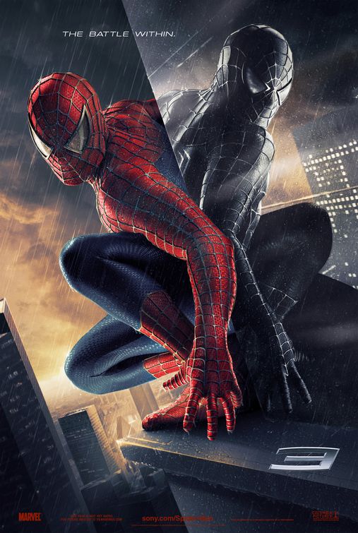
If you cannot see the picture, go to http://www.impawards.com/2007/spider_man_three_ver5.html

Movie Poster Analysis

http://www.toxicshock.tv/news/wp-content/uploads/the_strangers_poster3.jpg
I chose to analyze the poster from the movie The Strangers. The title of the movie is extremely applicable to the plot. In the image, one of the killers is lurking in the background while one of the main characters is oblivious to his presence in the room. The image used for this poster is perfect in describing the mood that is set in the movie as well as a good portrayal of the events that take place in the movie. The font of the title has an eerie characteristic to it. It is a very unique font and further distinguishes the scary movie genre the movie falls into. The colors used in the poster are all rather dark because the enemy is hiding in the darkness. The movie is mostly set in a darker color and the poster accurately portrays that. The darker colors used in the poster also make the movie seem frightening. There are two people on the poster. One person is the main character who is being stalked and followed by the other person in the picture, the man in the mask. The man in the mask is wearing a mask over his head and black clothing. He looks intimidating and evil. The girl in the poster is wearing normal clothing but has a very frightened look to her face. The combination of the man in the mask’s deceit and the terror on the girl’s face sells the film by establishing a sense of fear for the movie goers. The setting of the poster is the living room of the house used in the movie. The background is extremely dark which adds an additional sense of fear. If the background image was not as eerie and dark, the poster would not be as effective in accurately portraying the movie. The tagline for this movie is, “We tell each other there is nothing to fear, but sometimes we’re wrong”. This is a very applicable statement to add to the poster because it directly correlates with the message already established just by the picture. Another phrase on the poster is “Inspired by True Events”. This phrase also adds a sense of fear to the watchers because it adds a sense of realism to the movie when most scary movies are entirely false. Overall, the poster accurately portrays the eerie and scary tone the movie projects. All of the characteristics of it including the darker tones of color, the appearances of the characters on the poster, the font, and the taglines set up the scary genre the movie falls into. They all combine and compliment each other beneficially to accurately depict the movie’s theme.

Sunday, October 26, 2008

movie poster

The poster I choose to analyze was the blades of glory poster. The title is in direct relation to what is seen on the poster. Blades of glory is referring to figure skating, and Will Ferrell and Jon Heder reinforce that idea because they are both wearing ice skates. The movie is obviously a comedy, and the title backs that up. I find that blades of glory is a very sarcastic title poking fun at the seriousness of figure skating. Most Americans don’t find figure skating very interesting, and so having a title that is sarcastic to the sport would be something that most audiences would be interested in. The font has a very sharp clean cut feeling. It is the color, dark and light grey, that gives you the feeling that it looks similar to the blade of a skate. They overall color of the poster gives you the feeling of ice. Most of the poster is blue. This gives you the feeling of ice, and gives it a cool feeling, temperature wise that is. Most of your attention is drawn to the two people in front, Will Ferrell and Jon Heder. I have not seen the movie, but it is obvious that these are the two main characters. Both of them are in very flamboyant positions, and are posing as if they are in a figure skating competition. They are both wearing extremely flashy clothing so you don’t take them seriously, and you can’t help but smile. The clothing is skin tight, bright colored red for one and blue for the other, and both suits cover most of their skin and they are also glittery. Overall, they outfits that they are wearing are over the top, and poke fun at the clothing that is worn in figure skating. The background is of an indoor stadium that has an ice rink. It would be a complex background because it has a large crowd, but the distraction is taken away because they are tinted by blue. The background reinforces the assumption that the movie is going to be about figure skating. The poster also has a comical tagline. The tagline is “kick some ice,” which is meant to make you laugh. It’s comical because ice replaced the word “ass,” that would typically follow “kick some.” The overall message of the poster is to get you to laugh and want to see the movie. Since both the main characters are male, that plays a role in why you laugh. Most people don’t find figure skating to be the most masculine sport, so putting two men in figure skating outfits makes you laugh.

Wednesday, October 22, 2008

Presidential Debate

The main goal that many American citizens expected to be accomplished in the final presidential debate was the clarification of accusations made by their running mates. Many facts were let out during the debate; however there were more than the facts that made one of the candidates the particular favor. To be considered the winner of this debate, a candidate must show complete and total knowledge of their actions in the past and support with correct facts while disclaiming their counter arguments.

Barrack Obama clearly stepped up to the plate this debate. Obama definitely answered the questions and responded to McCain‘s accusations strongly and respectfully. McCain stated: “He voted twice for a budget resolution that increases the taxes on individuals making $42,000 a year.” Obama responded with: “Now with respect to a couple of things Senator McCain said, the notion that I voted for a tax increase for people making $42,000 a year has been disputed by everybody who has looked at this claim that Senator McCain keeps on making.” Obama left McCain in a dead stop because this was a topic in the media that many people have talked about already and the fact of the matter is that what McCain is trying to accuse Obama is incorrect and the media already made this conclusion. If McCain continues to try and bring up topics that his running mate can easily disprove, there is a slim chance that McCain would gain more votes from the public.

Not only is the factual evidence the candidates presented a strong part of their effort to win the debate, their behavior and ability to produce an answer to the given question is a strong force as well. McCain seemed to struggle to stay on topic especially when Schieffer asked what programs would be eliminated to decrease the deficit. McCain first responded by mentioning home ownership and his tangent was completely off to the relevance of the question. Schieffer had to remind McCain to answer the question correctly and when Schieffer reminded him, McCain gave a very general answer that he can eliminate certain programs, but Schieffer had to remind McCain which specific programs he would have to postpone or eliminate. Barrack Obama clearly said that he would go line by line and eliminate certain programs that are overfunded or unnecessary.

Both candidates came to this debate with one goal in mind, to secure their position as president. However the main focus on this debate for the American people revolved around the facts and claims of each candidate. McCain certainly let out a lot out of information, however he attempted more to win the hearts of the American people by ethos, and emotionally affect the viewers. Barrack Obama was able to clarify much of what was in the media and what was seen in a lot of senator McCain’s T.V. ads. Obama logically approached the American people and gave them the numbers and facts that the viewers wanted to hear. With a great economic problem ahead of this country, people want to hear how we are going to get out of this tough situation instead of who was hurt more.

Because Obama met the requirements and expectations of this debate I believe in terms of the American people and current issues in the media, Obama led the debate to a safe victory over McCain.